Client
Maili.uz -new voice of business and brands in Uzbekistan
Online publication Maili.uz — this is a bold and modern media resource about business, brands and the economy. It publishes in-depth materials and analytics about both global companies and local Uzbek entrepreneurs, ideas, initiatives and philosophies.
This media is not about dry numbers, but about meaning, movement and development. Maili.uz — it is a platform that gives voice to those who shape the economy of the future, who build companies with meaning and share values that go beyond financial statements.
We, Jedy MediaWe were invited to the earliest stage and took on the full development of the brand-from naming to the visual system. This project was a real challenge for us and a matter of great pride.
Concept creation and positioning
The first stage was a strategic analysis of the brand's future. We understood that it should be a publication that would become a bridge between intellectual business content and emotional, culturally significant perception in Uzbekistan. Maili.uz — this is:
- next-generation media platform;
- the voice of a progressive, thinking and acting entrepreneur;
- a publication with a recognizable vibe: smart, modern, and a little cheeky;
- a trusted publication that is interesting to read and that you want to quote from.
We have formulated the positioning in which Maili.uz performs as a guide between ideas and a broad audiencehelping businesses not just express themselves, but deliver their own message. mission, philosophy and values.
Name: "Maili"
as a cultural code
Title Maili.uz — this is a reference to the live Uzbek expression " Hop, Miley”which in everyday speech means consent, openness to action, and willingness to move forward.
We chose this particular word because it reflects:
- entrepreneur's mentality - flexible, open, ready to try;
- emotional contact with the audience - lightness, humanity, closeness;
- modern tone of communication - confident, informal, but respectful.
Maili "it's a word with character. It is ironic, but serious, lively, but structured. It says: "We know what we're doing. And we are open to new things."
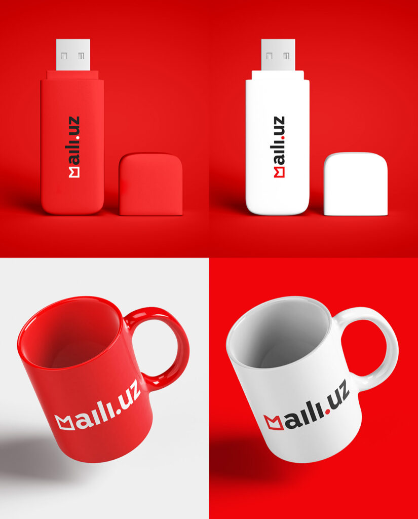
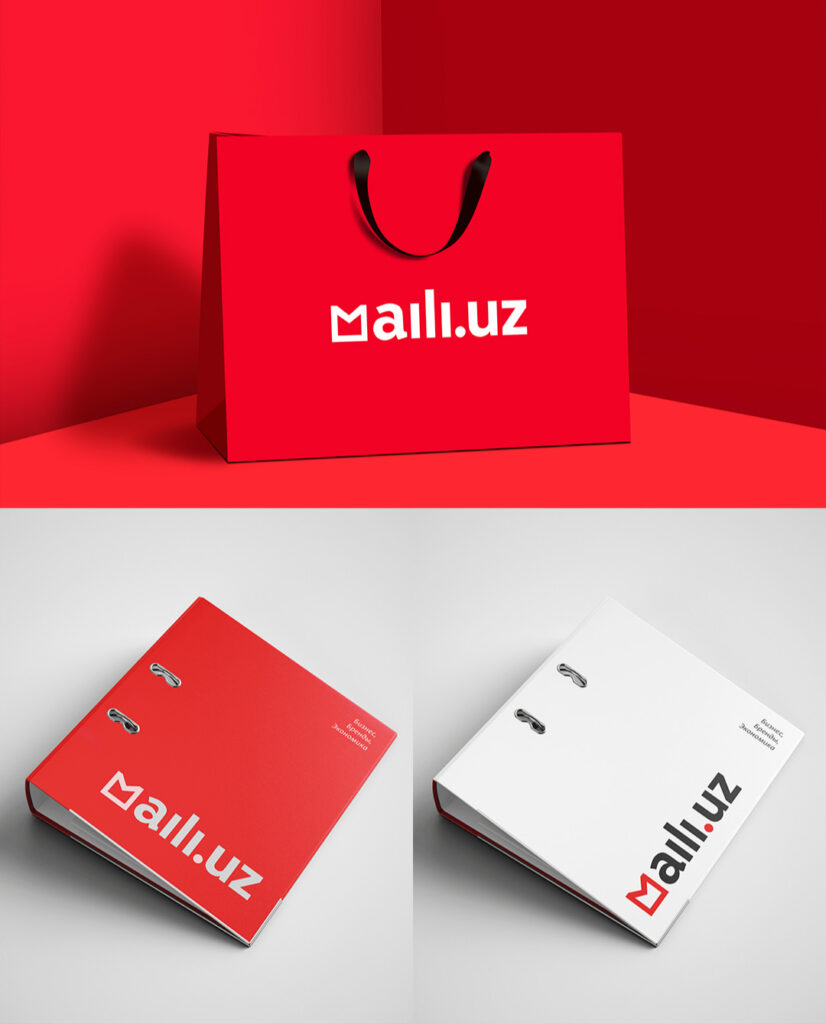
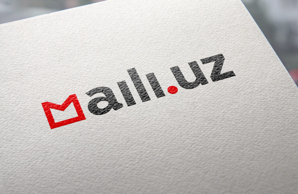
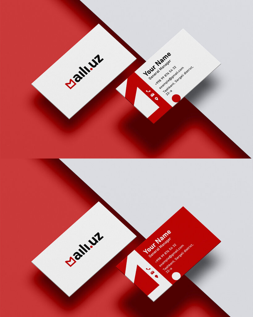
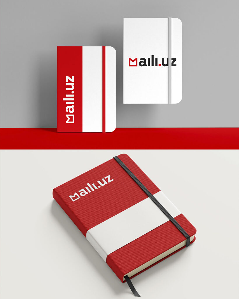
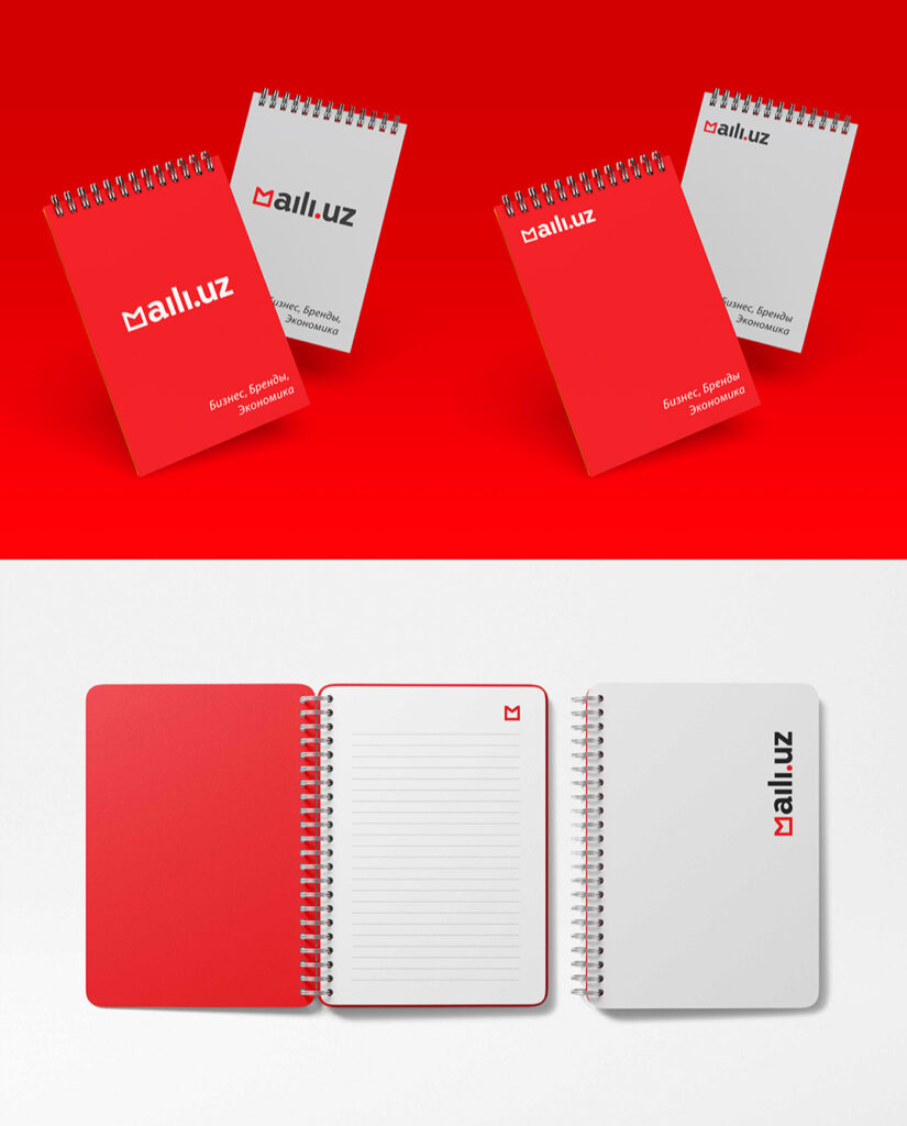
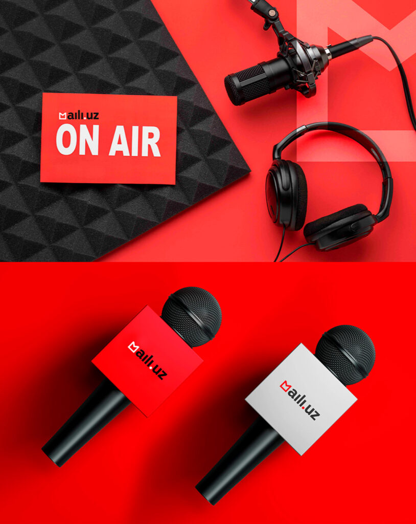
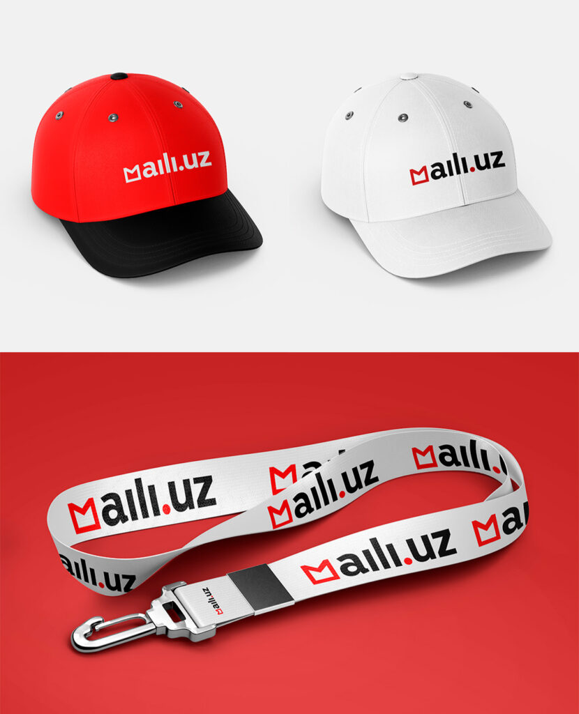
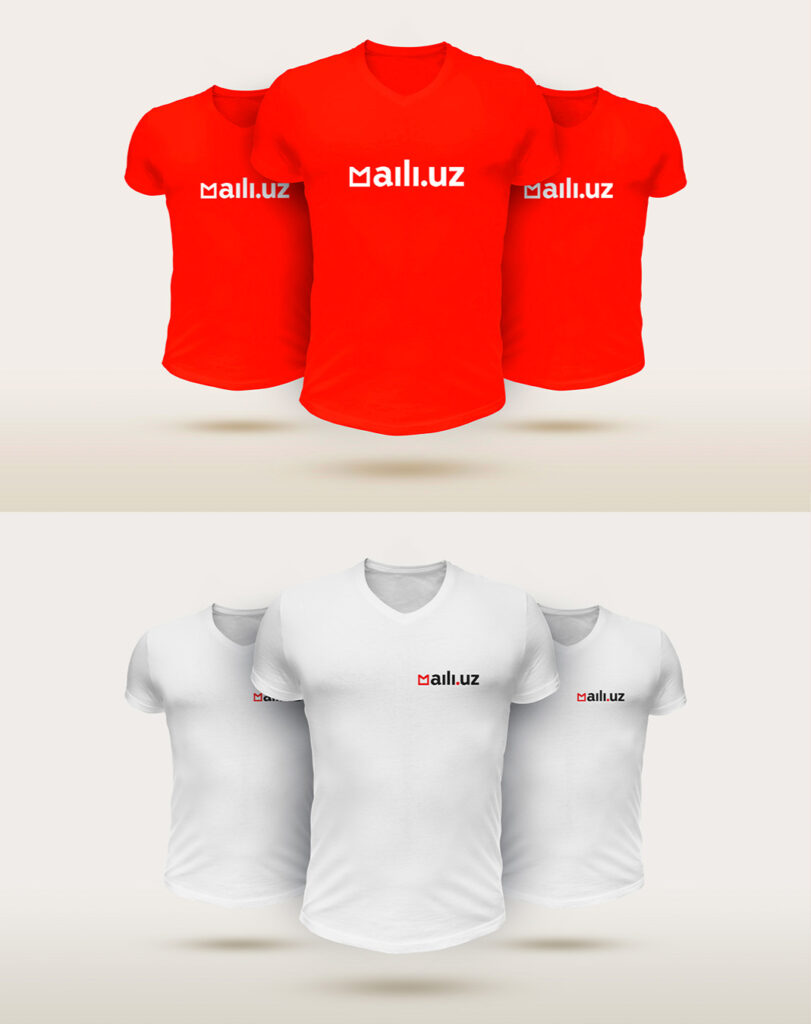
Logo and identity
The visual identity is based on a minimalistic but memorable logo. It is based on — graphic symbol in the shape of the letter " M”, which resembles both an envelope (as a symbol of media, letters, and messages) and an arrow (as a symbol of movement and growth).
Branded colors: Psychology and meaning
- Red (primary) - bright, rich, energetic color. It symbolizes action, confidence, passion and movement. It is the color of attention and leadership. For the media — this is a way to stand out and express yourself.
- Black — color strength, professionalism and depth. It emphasizes the seriousness of the approach and the structure of thinking.
- Dusted grey — color balance, restraint, and adaptability. It helps soften the visual experience and create a premium feel.
- White — color openness, air and freedom. It sets a clean visual space for content.
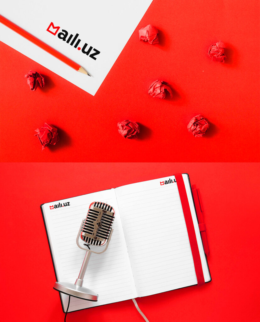
Font and iconography
We have developed visual system, where each element highlights the brand's character: modern, confident, a little cheeky, but extremely readable. Were also created branded icons and patternsthat reflect both media topics (business, brands, economy) and cultural codes.
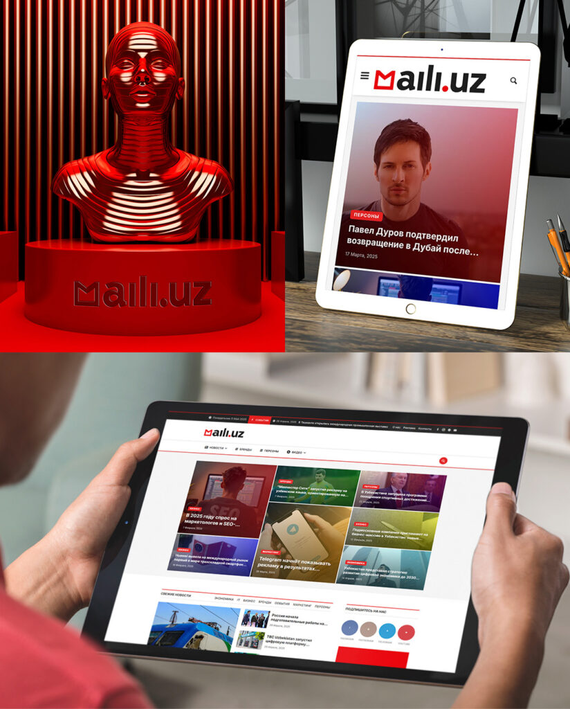
Website development: a platform that you want to return to
Full site development has become an important part of our work Maili.uz -from UX / UI to final integration. Our goal was to create not just a media platform, but an intuitive, user-friendly and inspiring digital product that supports the brand's philosophy and enhances the user experience.
UX Architecture: Navigation with character
We started with detailed prototyping of the user path. The main task is to balance between ease of navigation and depth of content. An important element was the adaptive design, thanks to which Maili.uz it works equally well on all devices-from smartphones to desktops.
The sections were organized in such a way that the user always knew where they were, and could easily find the material they were interested in — whether it was analytics, interviews, or author's columns.
UI design: visual support for meaning
The site's design continues the brand's language: a red accent, lots of air, large typography, and visual markers of articles that form a habit of returning. We used a card-based content presentation system, focusing on covers, content type, and duration.
Animations and microinteractions
To enhance the feeling of liveliness and dynamics, we have implemented subtle animations: smooth transitions, reactions to hover and the appearance of elements when scrolling. It's not just decorations — it's a way to make navigation more enjoyable and emotionally engaging.
CMS and technology base
The site is built on a custom content management system that allows editors to flexibly work with materials-from planning publications to automatically generating previews and SEO settings. We have integrated analytical tools, provided high loading speed and optimization for search engines.
Support and development
Website Maili.uz " it's a living organism. We have provided technical support, the ability to scale and add new features, including the long-read format, podcasts, thematic special projects, and integration with external platforms.
Why this is important
For us, this is not just a project. manifesto of what a modern Uzbek brand should look like. This is the result of hard, deep work by the entire team, from strategists to designers, from copywriters to art directors.
We can't give the client's name for certain reasons, but we do we pride ourselves on trust and the fact that we created from scratch not just a style, but an identity for a brand that now helps others tell your stories to the world.
We are ready to help your project find its voice, its form, and its audience.
Jedy Media — brands that make sense.