Client
Horoshi Sushi — this is an atmospheric sushi bar that offers visitors not just Japanese cuisine, but a full immersion in its culture. The main focus here is on a unique combination of authentic recipes and a modern approach to serving dishes. A team of professionals Horoshi Sushi it works to make every guest feel special and enjoy the real taste of Japanese dishes, whether it's fresh rolls, sushi, sashimi or exclusive items from the chef.
The interior of the bar is designed to emphasize the spirit of Japan and allow guests to fully relax in a stylish and cozy atmosphere. Here, every dish and every decorative element is aimed at creating a unique and memorable atmosphere.
Task
Our marketing agency was given the task of developing a complete branding for a new sushi bar. The goal of the project is to create a unique and attractive image that will distinguish the institution from competitors, forming a recognizable style and attracting the target audience. The project consists of several stages:
Naming convention: Developing a name for a sushi bar that reflects the philosophy and atmosphere of the establishment. The name should be short, memorable, easy to pronounce, and associated with Japanese culture.
- Tagline: Creating a short and succinct slogan that will emphasize the uniqueness of the establishment and its key values.
- Logo: Development of an original logo that will become a visual symbol of the brand. The logo should be simple, but at the same time unique and reflect the Japanese style.
- Brand phrases: Create a number of brand phrases that will be used in advertising, social networks, and design. These phrases should convey the mood of the establishment, its exclusivity and special approach to guests.
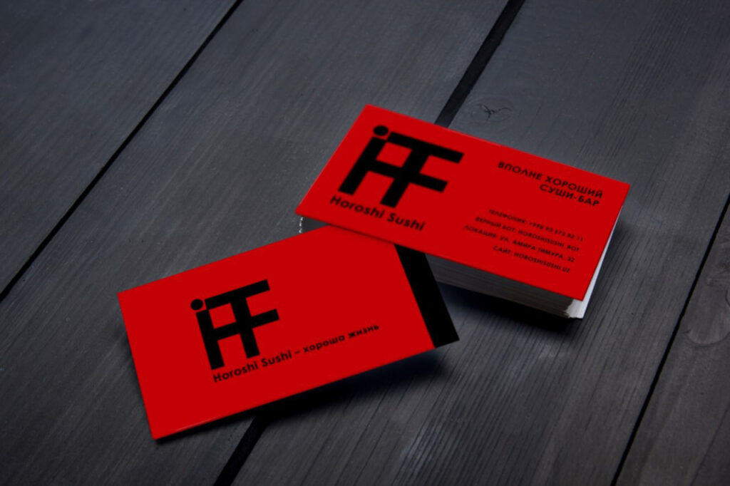
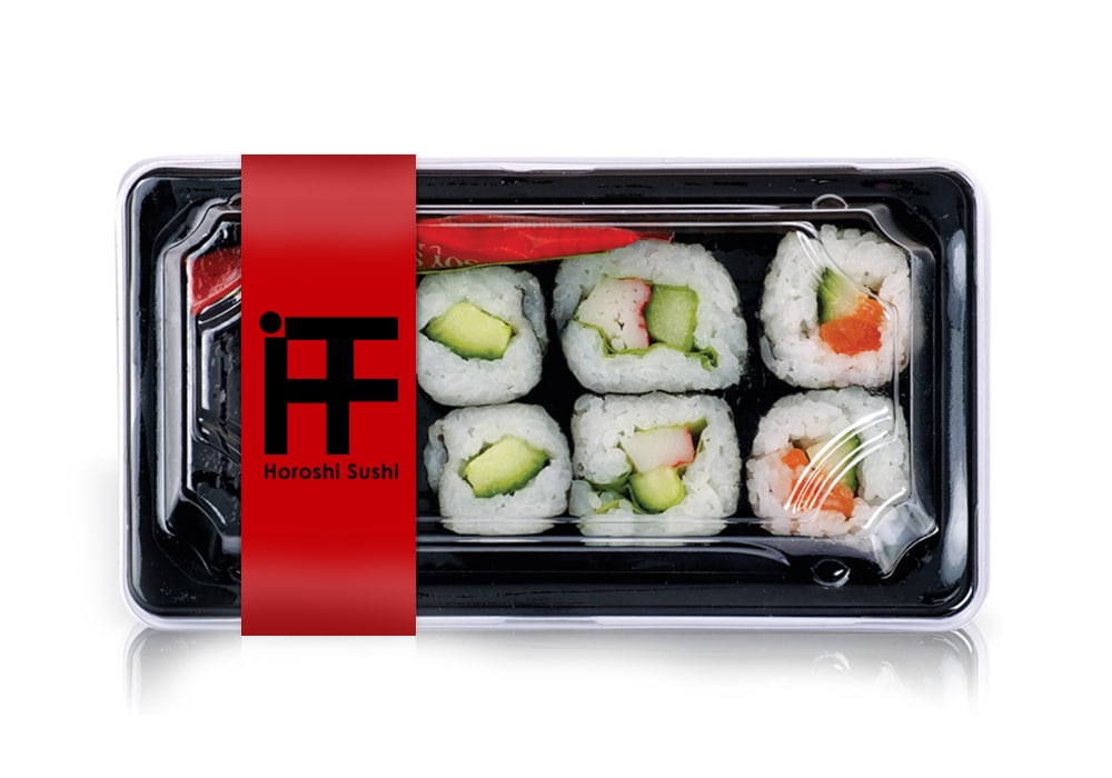
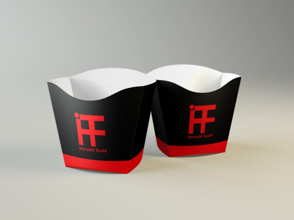
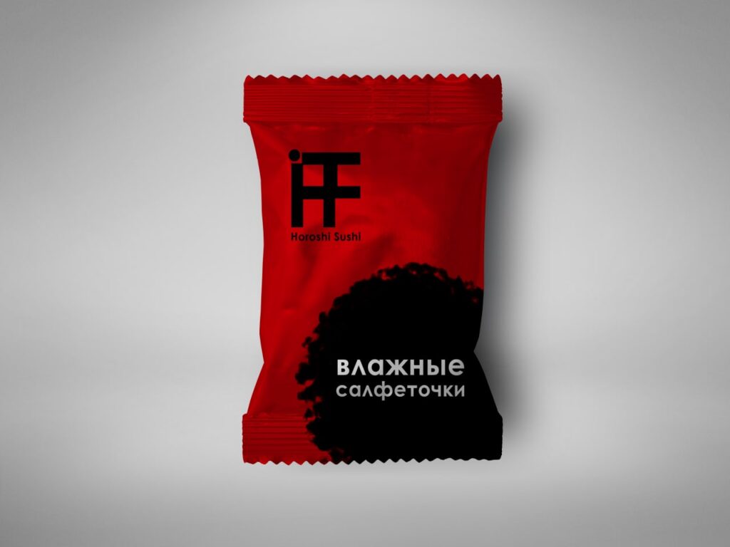
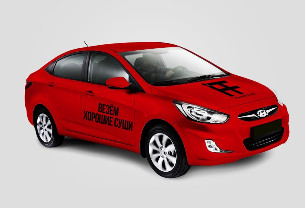
- Corporate identity: Define the color palette, fonts, and visual elements that will be used in interior design, packaging, website design, and advertising. The goal is to create a complete and memorable visual image.
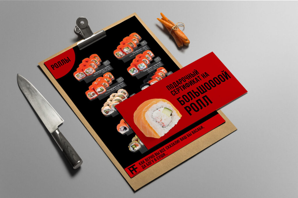
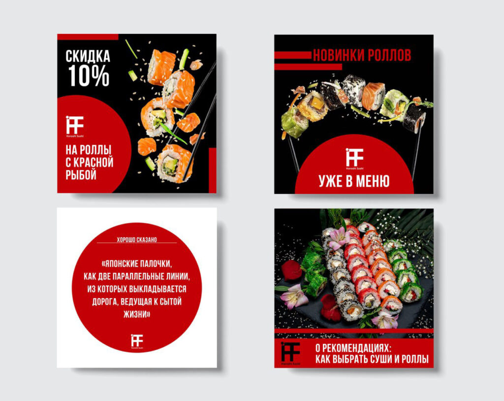
- Design for SMM: Create templates for posts, stories, and advertising posts in social networks. Visual content should be adapted for promotion in the online space, taking into account the corporate identity and preferences of the target audience.
Decision
Our agency offered a complete solution for creating a brand that reflects the unique atmosphere and style of the establishment. Having included a range of services, we focused on developing a complete branded package that will become the face of the brand and help it stand out in the market.
Naming convention "Horoshi Sushi "(read as-Sushi is good). A Russian phrase with a Japanese sound. Clearly emphasizes that sushi is really good. The name itself is a source of imagination for marketers and creatives. It makes it possible to come up with interesting advertising campaigns and play with the consumer, attract them, interest them and be remembered.
Tagline "Horoshi Sushi-good life!" tells us that delicious and high-quality sushi (and other Japanese cuisine prepared with the soul and according to all the rules) directly affects the improvement of our lives. Good food lifts our spirits, a well-fed person is a kind person.
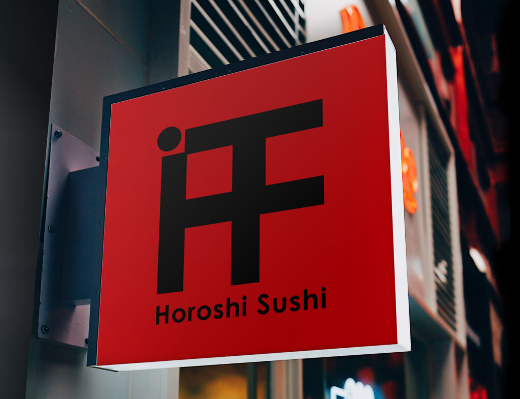
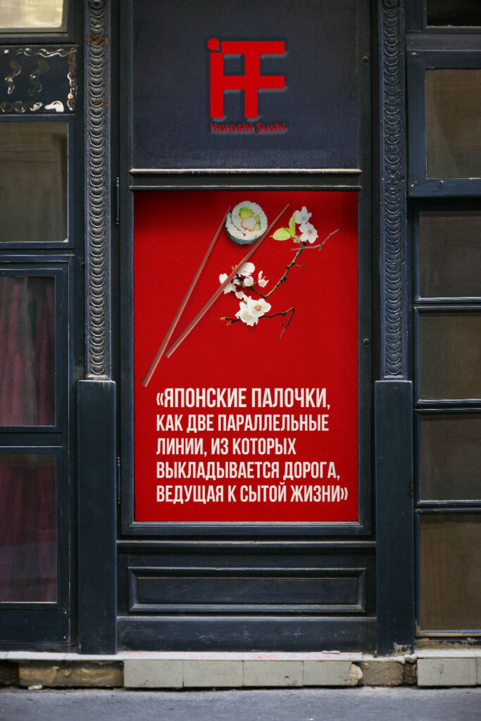
Logo It is a simple sign, but it contains a lot of symbolism. First of all, looking at the logo, you can see a stylized hieroglyph, which was obtained due to the combination of some letters present in the name "Horoshi Sushi". In addition, if you look at the elements of the logo separately, the dot (circle) in the upper-left corner of the logo can symbolize the sun of Japan, and the grid made of straight lines is associated with the traditional design of Japanese doors in the Shoji style, which tells us about the hospitality and goodwill of the brand.
Corporate identity It combines three colors that are included in the palette of the main traditional colors of Japan, namely-red, black and white.
- Red color, or "aka", is very popular in Japan and has an ancient meaning. Since time immemorial, it has been believed that red deters the forces of evil and symbolizes peace, justice and prosperity.
- Black Colorkuro, or "kuro", is a masculine color in Japan. In the past, this color belonged to the samurai class, but now it is used for special occasions and symbolizes enlightenment.
- White color, or "shiro", is considered the sacred color of the gods. It symbolizes spiritual and physical purity.
As branded elements corporate style uses all the same shapes that are present in the brand's logo: circles and straight lines.
Tone of Voice:
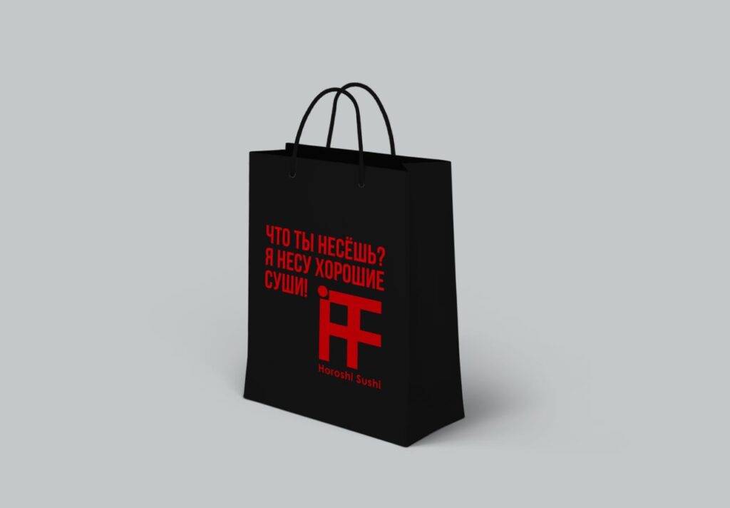
Horoshi Sushi he will use a restrained but warm and friendly tone that is both wise and humorous, combining light wordplay with respectful treatment of customers. In communication, the brand will emphasize the Japanese heritage and high standards of service, creating a trusting and inviting atmosphere.
Brand phrases and quotes they enliven the brand, reflect its character, philosophy, and connect with the consumer. So, for example, for the poster of a sushi bar, the following conclusion was invented::
- "Japanese chopsticks are like two parallel lines that form the road leading to a well-fed life."
Result
Review: "I want to thank the team for the project, which gave us and our clients a lot of positive emotions. Designing the branding for our sushi bar was not just a job — it was a real adventure, where each stage brought something new and unexpected. I must admit that our meetings were full of laughter (in a good way!) and fresh ideas. We didn't think that anyone would be able to capture the atmosphere of our future establishment so deeply, but the agency did it with amazing accuracy and sincerity.


