B2B- services often suffer from a reputation for being "gray" and boring. Logos in blue tones, an abundance of technical jargon and the same sites in the style of "nothing superfluous" - all this makes them memorable. However, even the driest and most rational products can find life face. Below is a detailed analysis of how to design a B2B service so that you want to study it, remember it, and trust it.
Understand not the product, but the customer's task
A common mistake in B2B communications is obsession with functions. The client is not interested in the fact that you have a " Python API with multi-level caching”. He is interested in how this will solve his task-simplify processes, reduce costs, and eliminate headaches. Start packaging not with a description of yourself, but with the wording of the client's pain.
Create a portrait of the target audience: who makes the decision, what they fear, what they want, and how they consume information. This will help you build a visual and text feed that works for the user's perception.
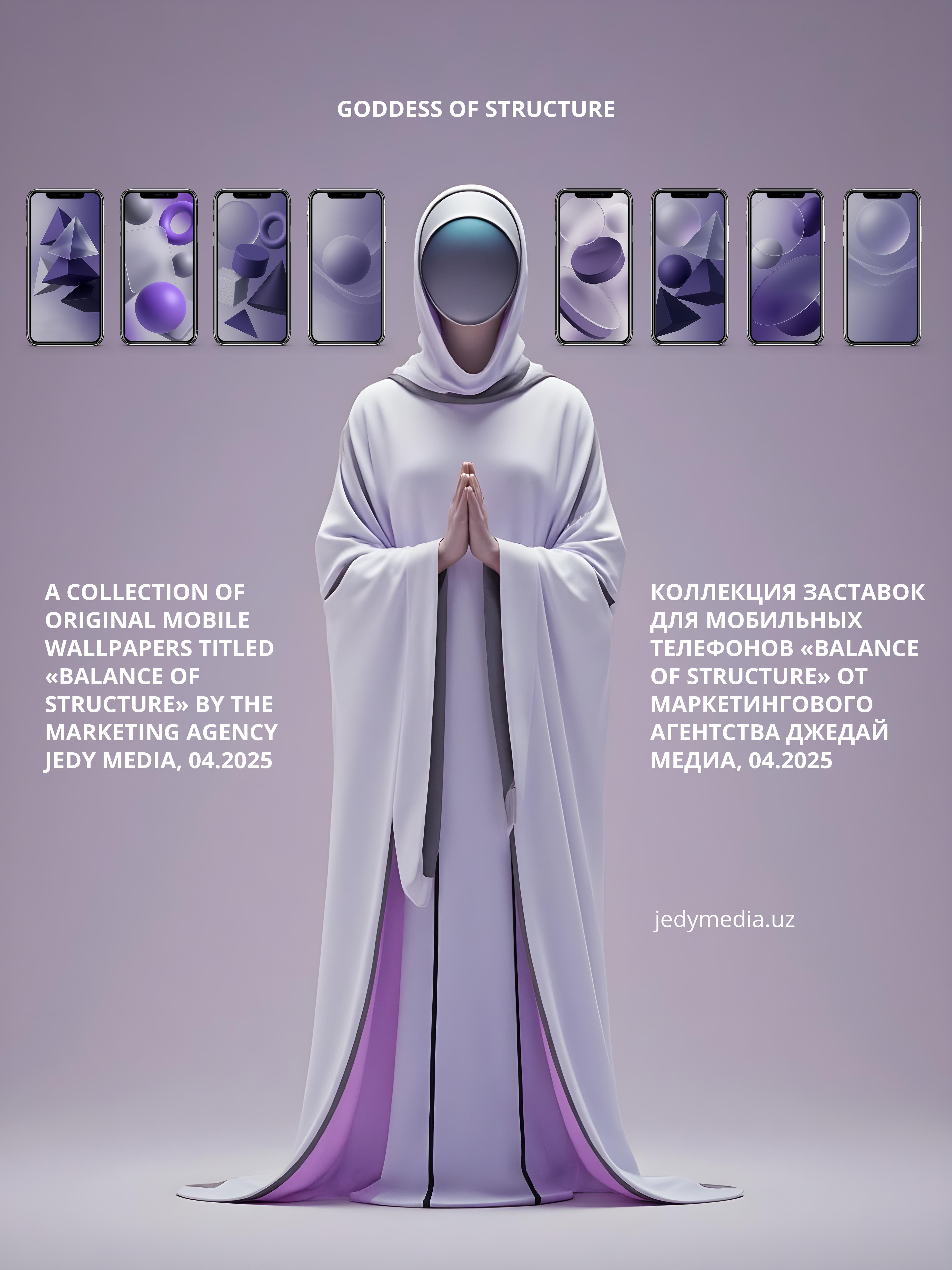
Create a visual metaphor to use UGC in your promotion
A B2B service often lacks a visual "anchor" — something that is fixed in memory. The solution is to use a metaphor. For example, a process automation service can be represented as a precise mechanism, brain, or navigator. A visual metaphor can become part of a logo, animation, icons, and illustrations.
It is important not to complicate things: you don't need ten characters, just one image that permeates the entire style.

Color palette: Don't be afraid to go out of bounds
The stereotype that B2B is necessarily blue and gray has long been outdated. Of course, the palette should correspond to the sphere (a financial company in acid colors will cause distrust), but within the framework of common sense, there is a place to move.
Warm accents, pastel shades, deep natural colors, matte textures - all this can create a sense of modernity and reliability at the same time. Color is an emotion. Even in the most rational business, there is a place for emotions.
Choose expressive typography
Fonts in B2B are not just a matter of readability. It's a way to express your character.
Rough grotesqueness can emphasize technological efficiency. Slightly smoothed geometric font — friendliness and modernity. Neat with serifs — structure and order.
The main thing is to keep the balance. One accent font for headings, one strict font for text. And no random headsets "from the Internet".
Animation and microinteractions
Even minimal movements keep the interface alive. An animation can explain how a B2B service works, or show the transformation of a problem into a solution. It holds your attention, especially when the content is complex.
Microinteractions include hover effects, animated icons, and smooth transitions between sections. Such details create a sense of thoughtfulness and care. This means trust.
Visualize the "boring" in numbers and processes
Charts, infographics, diagrams, and icons are all ways to keep the complex simple. But not in a boilerplate way. Don't use the same pie charts with the same colors. Add your corporate identity, appearance animation, and illustrations.
If your B2B service processes hundreds of thousands of requests, show it as a flow, as a movement. People perceive actions better than static.
Work with faces
B2B is often afraid of "humanity". But trust is born through faces, even in the driest topics. The team, experts, and customer cases are a great opportunity to add life.
If appropriate, make a photo shoot in the style of the brand. If not, use neutral but lively illustrations of the characters. The main thing is not to hide behind graphs and templates.
Make a route from the site, not an archive
The main page of a B2B service is not a museum of functions. This is a road map. It should make it clear where to go: how to learn more, how to try it, how to order.
Add hints, highlighted CTA blocks, and progressive information disclosure. Let the visual structure guide the user like an experienced consultant.
Combine visual and textual content
You can't separate packaging from meaning. A beautiful site with a dry tongue is dead. Just like the other way around. The words and visual should support each other.
If your B2B service "helps to reduce costs" - show it through the plot: here was the problem, here is the change, here is the result. Text reveals, visual supports.
This is especially important for landing pages and presentations — where each block should work like a story.
Check everything through the prism of sensation
At the final stage, ask yourself a simple question: what feelings does your website or presentation evoke? Reliability? Transparency? Modernity? Or boredom, excessive technical skills, or fatigue?
A B2B service designed with attention to emotions is doubly beneficial. After all, competitors are likely to continue to speak the language of "cloud solutions and system integrations".